Usage
This section provides examples of how to use Neurostates. Follow the instructions below to get started and make the most out of the package.
Basic Usage
Overview
In neuroscience research, a common setup involves comparing two or more groups — for example, healthy controls and patients — to uncover differences in brain dynamics. One powerful approach to characterize these dynamics is to extract brain states from functional connectivity patterns over time.
This page will walk you through the necessary steps to implement a brain states analysis with this library.
Step-by-step Example
Load data
We load two groups of subjects — controls and patients — where each subject’s data is a time series of brain activity (e.g., from fMRI or EEG). It must be of size (subjects x regions x time)
import numpy as np
import scipy.io as sio

group_controls = sio.loadmat("path/to/control/data")["ts"]
group_patients = sio.loadmat("path/to/patient/data")["ts"]

groups = {
    "controls": group_controls,
    "patients": group_patients
}

print(f"Control group shape (subjects, regions, time): {group_controls.shape}")
print(f"Patient group shape (subjects, regions, time): {group_patients.shape}")
Control group shape (subjects, regions, time): (10, 90, 500)
Patient group shape (subjects, regions, time): (10, 90, 500)
Build the pipeline
Neurostates implemented a scikit-learn Pipeline that includes all of the important steps required for brain state analysis. The pipeline includes:
A sliding window that segments the time series
Dynamic connectivity estimation (pearson, cosine similarity, spearman’s R, and even your own custom metric)
Concatenation of all matrices across subjects
Clustering using KMeans to extract brain states
from sklearn.cluster import KMeans
from sklearn.pipeline import Pipeline

from neurostates.core.clustering import Concatenator
from neurostates.core.connectivity import DynamicConnectivityGroup
from neurostates.core.window import SecondsWindowerGroup


brain_state_pipeline = Pipeline(
    [
        (
            "windower",
            SecondsWindowerGroup(
                length=20, step=5, sample_rate=1
            )
        ),
        (
            "connectivity",
            DynamicConnectivityGroup(
                method="pearson"
            )
        ),
        (
            "preclustering",
            Concatenator()
        ),
        (
            "clustering", KMeans(
                n_clusters=3,
                random_state=42
            )
        ),
    ]
)
Then you can use the fit_transform() method to transform your input data and get the centroids (brain states)
brain_state_pipeline.fit_transform(groups)
brain_states = brain_state_pipeline["clustering"].cluster_centers_

# Originally brain_states will be a 3 by 8100 matrix.
# We reshape them to get the matrix structure back
brain_states = brain_states.reshape(3, 90, 90)
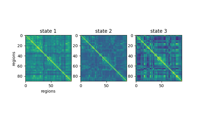
And you can plot them like so:
import matplotlib.pyplot as plt

fig, ax = plt.subplots(1, 3)
ax[0].imshow(brain_states[0], vmin=-0.5, vmax=1)
ax[0].set_title("state 1")
ax[0].set_ylabel("regions")
ax[0].set_xlabel("regions")
ax[1].imshow(brain_states[1], vmin=-0.5, vmax=1)
ax[1].set_title("state 2")
ax[2].imshow(brain_states[2], vmin=-0.5, vmax=1)
ax[2].set_title("state 3")
plt.show()
You can also access intermediate results from the pipeline, such as the windowed timeseries or the connectivity matrices:
connectivity_matrices = brain_state_pipeline["connectivity"].dict_of_groups_
print(f"Connectivity matrices has keys: {connectivity_matrices.keys()}")
print(f"Control has size: {connectivity_matrices['controls'].shape}")
Connectivity matrices has keys: dict_keys(['controls', 'patients'])
Control has size (subjects, windows, regions, regions): (10, 97, 90, 90)
Compute brain state frequencies
To evaluate how often each brain state occurs for each subject, we use the Frequencies transformer:
from neurostates.core.classification import Frequencies

frequencies = Frequencies(
    centroids=brain_state_pipeline["clustering"].cluster_centers_
)
freqs = frequencies.transform(connectivity_matrices)

print(f"freqs has keys: {freqs.keys()}")
print(f"Control has size (subjects, states): {freqs['controls'].shape}")
freqs has keys: dict_keys(['controls', 'patients'])
Control has size (subjects, states): (10, 3)
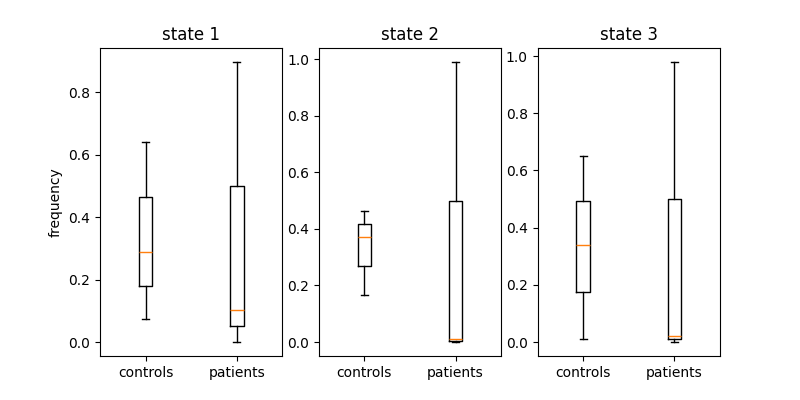
Finally, you can plot the frequency of each brain state in the data:
fig, ax = plt.subplots(1, 3, figsize=(8,4))
ax[0].boxplot(
    [freqs["controls"][0], freqs["patients"][0]],
    tick_labels=["controls", "patients"]
)
ax[0].set_ylabel("frequency")
ax[0].set_title("state 1")

ax[1].boxplot(
    [freqs["controls"][1], freqs["patients"][1]],
    tick_labels=["controls", "patients"]
)
ax[1].set_title("state 2")

ax[2].boxplot(
    [freqs["controls"][2], freqs["patients"][2]],
    tick_labels=["controls", "patients"]
)
ax[2].set_title("state 3")

plt.show()
If you want to know how to further customize these parameters please take a look at our module list.